The brief
Story led explainer animation
University can be incredibly tough. There’s a constant barrage of new experiences, learning and, most terrifying of all, deadlines. Life also doesn’t stop because your studying, in fact, sometimes it can even interfere with your studies. When this happens it can be really difficult and a stressful part of the university experience that you don’t need. Thankfully, this is where special considerations come into play.
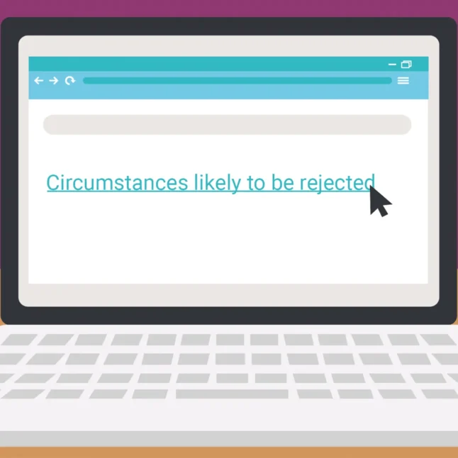
Special considerations are often misunderstood, which leads to applications that are likely to be unsuccessful or, even worse, not applying when you might be eligible. In order to make things clearer, University of Southampton asked us to create an explainer video that would help people who might need to apply for special considerations.
The messaging around special considerations had to reach a large audience. As such, it was necessary for us to create an animation that could be used flexibly on digital screens at the university, on their website, on various social media platforms and in email campaigns.
What we did
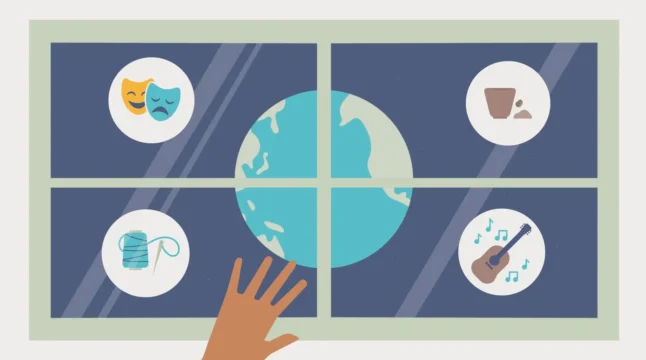
For us the biggest challenge was always going to be the style of the illustrations. The university has a strict brand, which doesn’t always allow for a lot of freedom. That being said, we didn’t want to be too restricted by what had come before to the point where it limited the story we were telling. To get around this, alongside script writing, we drew up some custom stylesheets. They showed how we could use characters and scenes in conjunction with the largely icon based style of the university. We made the case that this would expand the capability to tell a strong story that focused on people. Fortunately, they felt the same way!
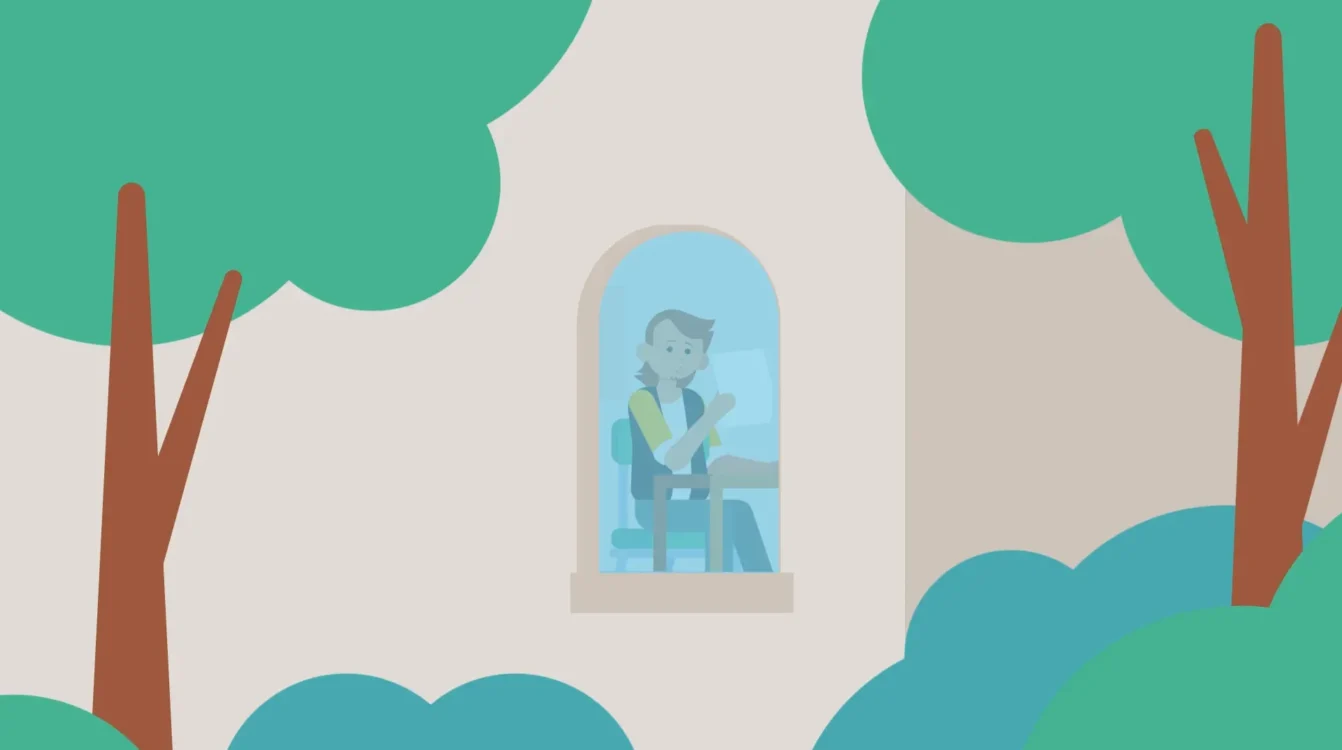
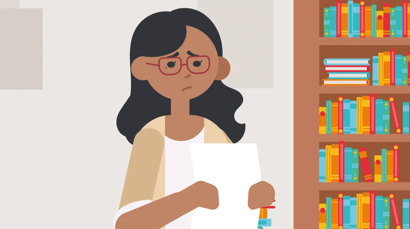
With a script and style signed off we set about illustrating. Our focus was on creating scenes that felt like they could be at the university. Some of the scenes were going to be set on coloured backgrounds (for scenes that focused on explaining something) but we wanted to get a good number of backgrounds in there too. We also worked to create characters that had some personality and would be good candidates for adding movement and facial expressions in the animation phase. All of this went into the storyboard, which we used as the basis for the animation itself.
When it came to the animation, we wanted the film to feel like there were as few scenes as possible. We didn’t want there to be too many hard cuts that pulled people out of the film or made them miss out on important information. This meant adding motion (even if it was subtle at times) and plenty of smooth transitions between scenes. As well as adding motion and expressions to the characters, this way of animating gave the film a really nice narrative flow.

The technical
Concept development
Story development
Scripting
Storyboards
Schedules and timelines
Style sheets
Illustration
Animation
Sound design
Music licensing
Stills and assets
The result
Informative animation for busy people
In the end, we were able to create a film that not only helped to inform people about the special considerations process, but also reassure them. Sure, this was an animated explainer video, but we also wanted the film to give people some comfort as well and remind them they aren’t alone. We feel like we achieved this balance, all while creating an animation that was engaging and energetic.
