The brief
Animation explainer video with a twist
We’ve been working with Drinkaware for quite a while now. We’ve come to expect certain stylistic choices and certain frameworks to work within. However, when this project came our way they expressed that they wanted the exact opposite of this. As a brand, they were looking to develop and create content that had a new, fresh feel, something that would help it feel different from their other content. We jumped at the opportunity to explore a new style with them.
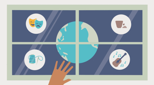
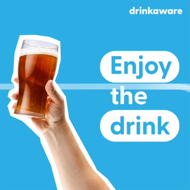
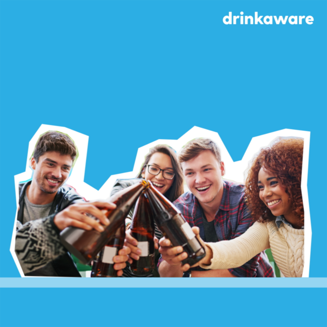
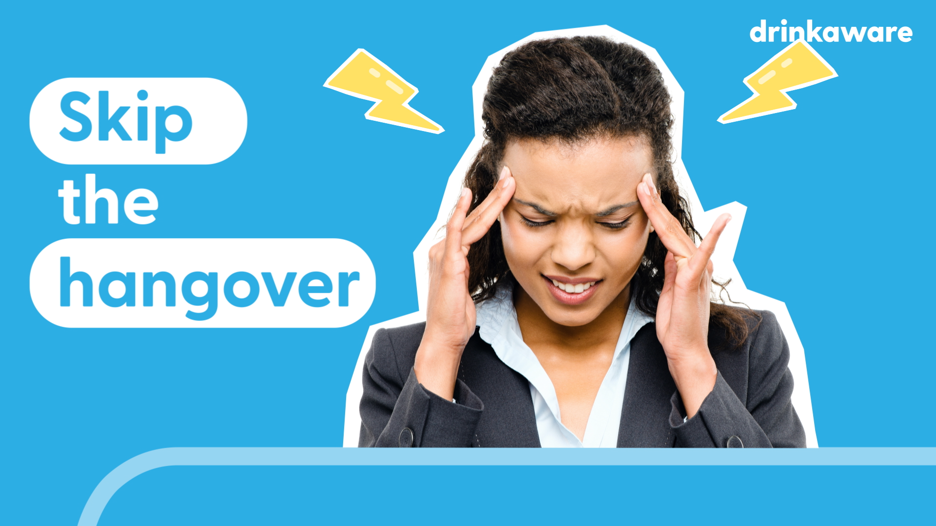
What Drinkaware wanted to create was essentially an ad for low/no alcohol drinks. Not one in particular though, but all of them as an alternative to alcohol (or as a way of reducing alcohol consumption). They wanted the film to be animated (which a lot of our work with them is) but they wanted us to steer away from their traditional characters. Instead, a more pop art style was preferred. It was felt that this might suit the charity’s evolving tone of voice.
On top of this, the film had to be bold, engaging and lighthearted. It couldn’t feel like a lecture or too hard at the risk of losing the audience.

What we did
This was kind of a new style for us and one that we’d been wanting to explore for a little while. The plan was to combine photo assets from stock sites, newly created illustrations and Drinkaware brand assets in a pop-art style. This meant bold outlines and assets that almost felt like they’d been cut out of paper. On top of this, we wanted to give the film an almost stop motion feel in places to heighten the style.
When the style sheets were signed off, we set about gathering all of the assets that we would need. We went through the script and trawled the usual stock photo sites to get what we could. We did this not only with a set budget in mind, but with Drinkaware’s guidelines on the portrayal of alcohol consumption too.
We create simple but visually striking scenes that would help visualise the script and it’s messaging around Low/no alcohol alternatives. These scenes were tied together with smooth transitions to help the animation feel cohesive and engaging.
The technical
Concept development
Style sheets
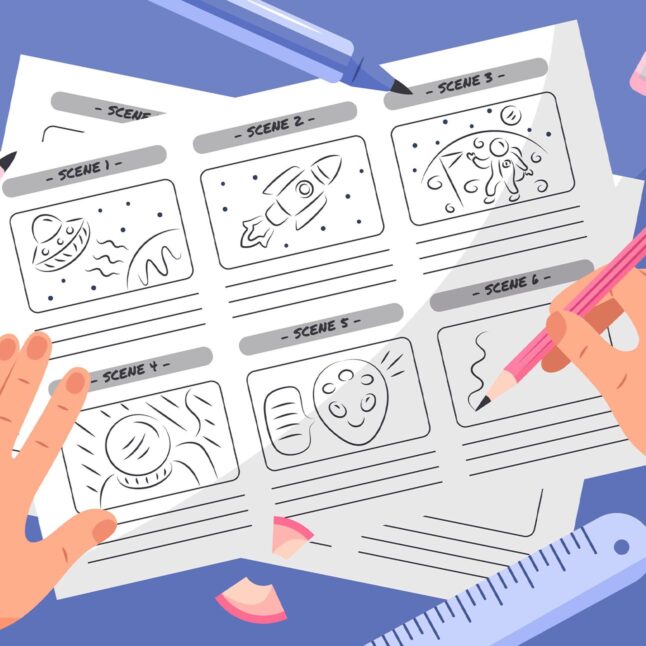
Storyboard
Schedules and timelines
Animation
Music licensing
Social cuts
The result
Pop art animated explainer
The result was a really short, punchy explainer animation that seamlessly fit into Drinkaware’s wider marketing strategy. We like it a lot, and we’re super happy to have been able to explore a new style with a client that we really enjoy working with.