The brief
Using data to tell important stories
Artswork is a charity that helps to empower young people by engaging them in arts and culture. As a charity they push for young people to have increased access to the arts because of how this can impact their future. This interaction with creativity can be the basis for young people finding their passion, to realise their potential and to build a future for themselves.
Artswork makes this possible by building partnerships with schools, facilitating arts sessions and advocating for arts and culture being available as part of all young people’s education. Not only is this work impactful and important, it yields a lot of valuable data. This data is useful for understanding the impact of the work, but it’s also a great way of communicating to others why this work must continue. The difficult thing is though, sometimes data can be hard for people to process. It’s tricky to understand and can be a little impenetrable, which is a problem.
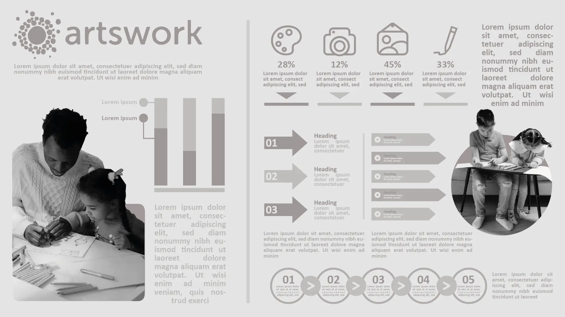
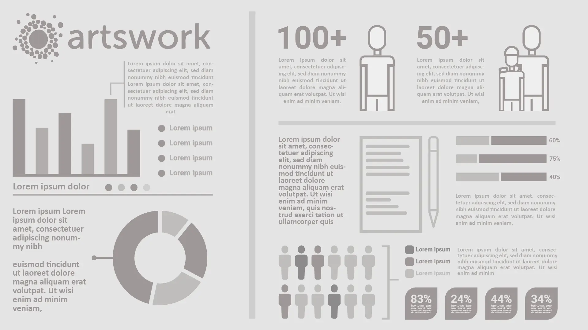
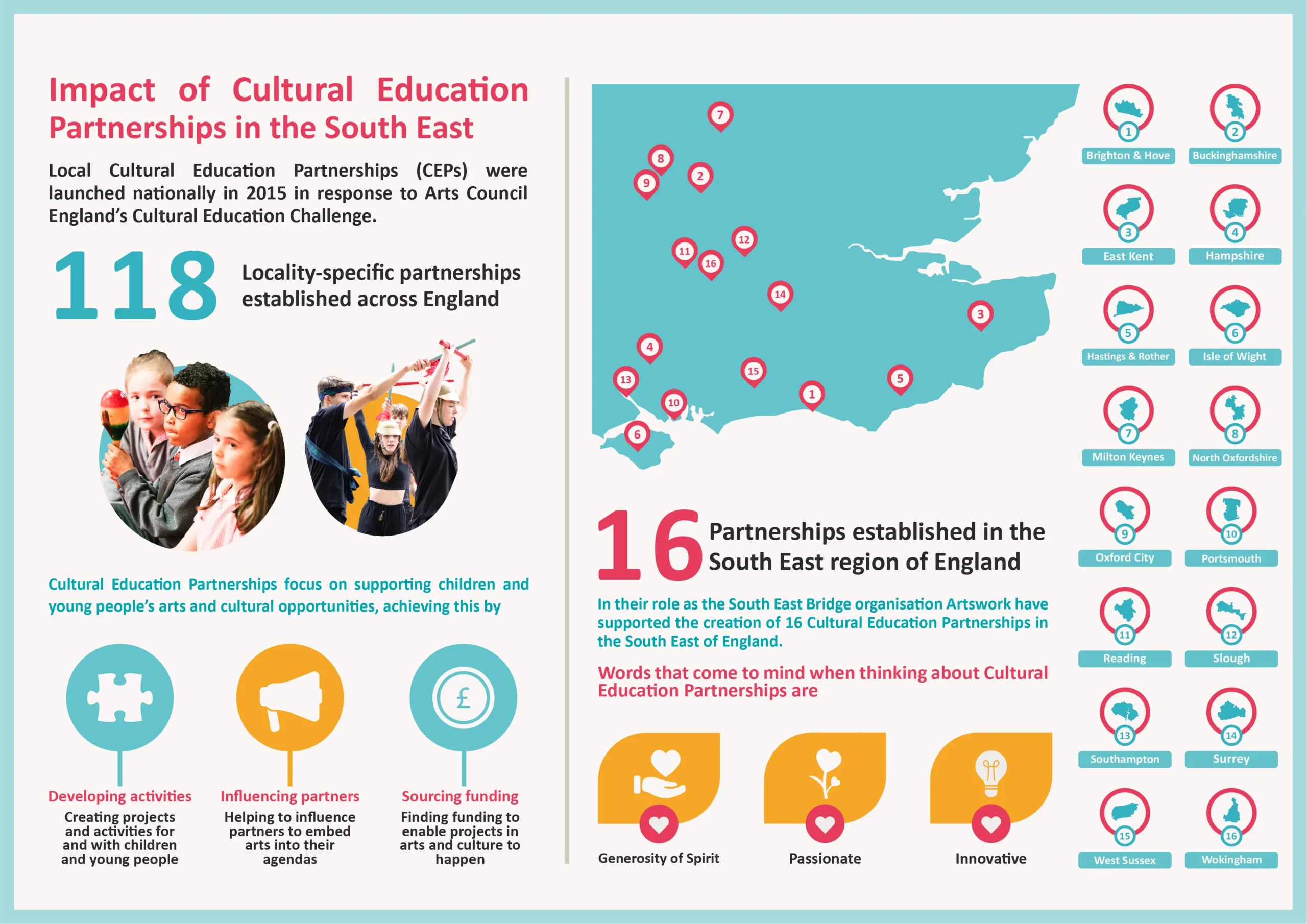
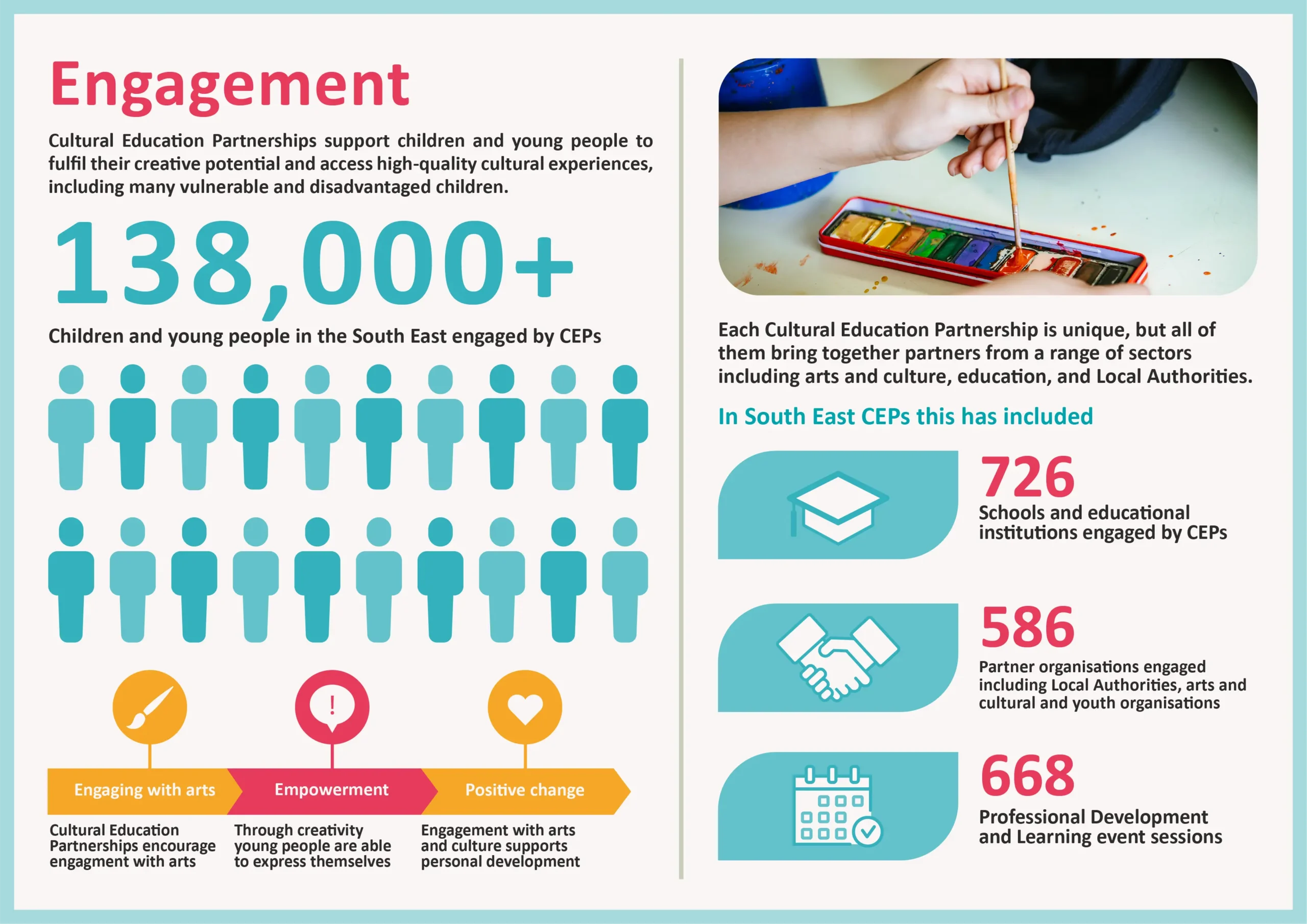
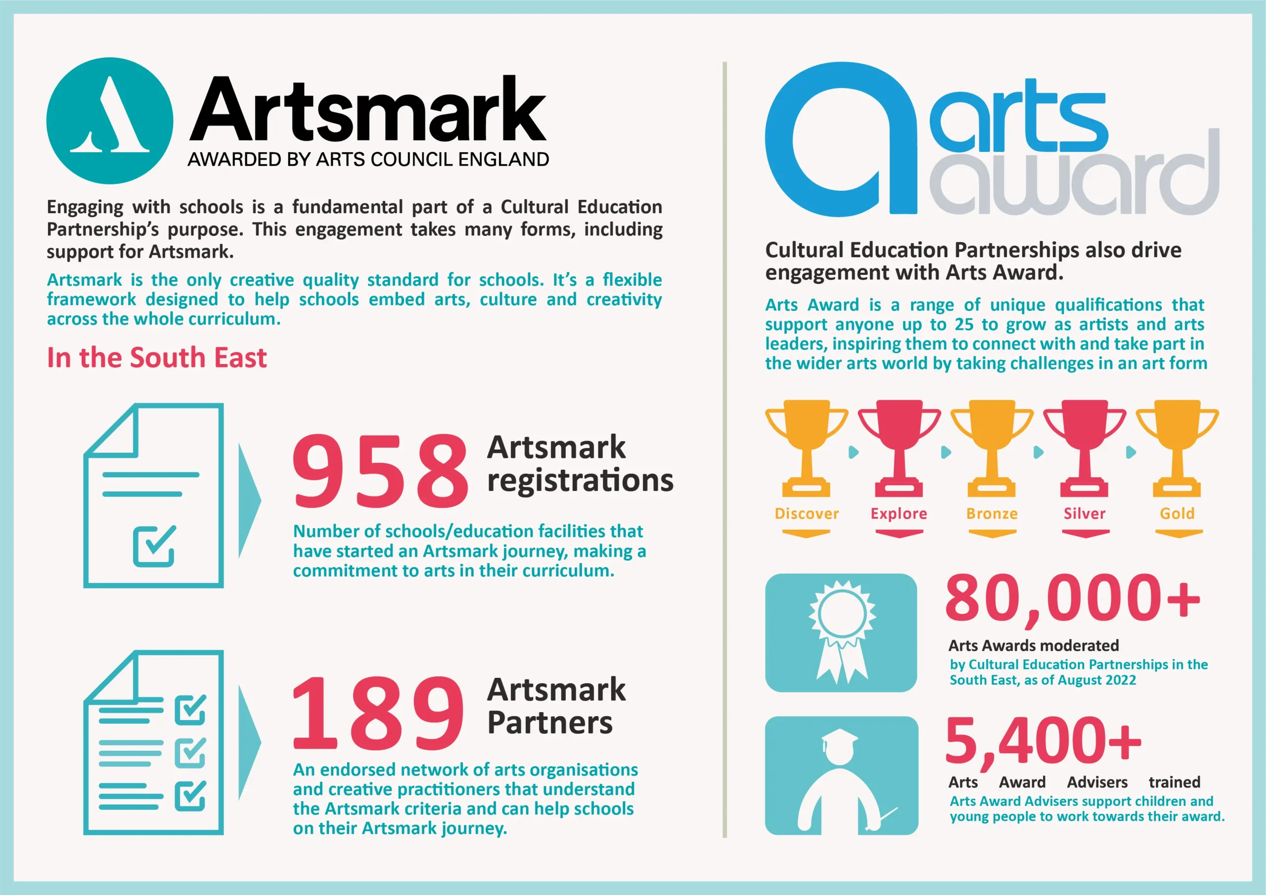
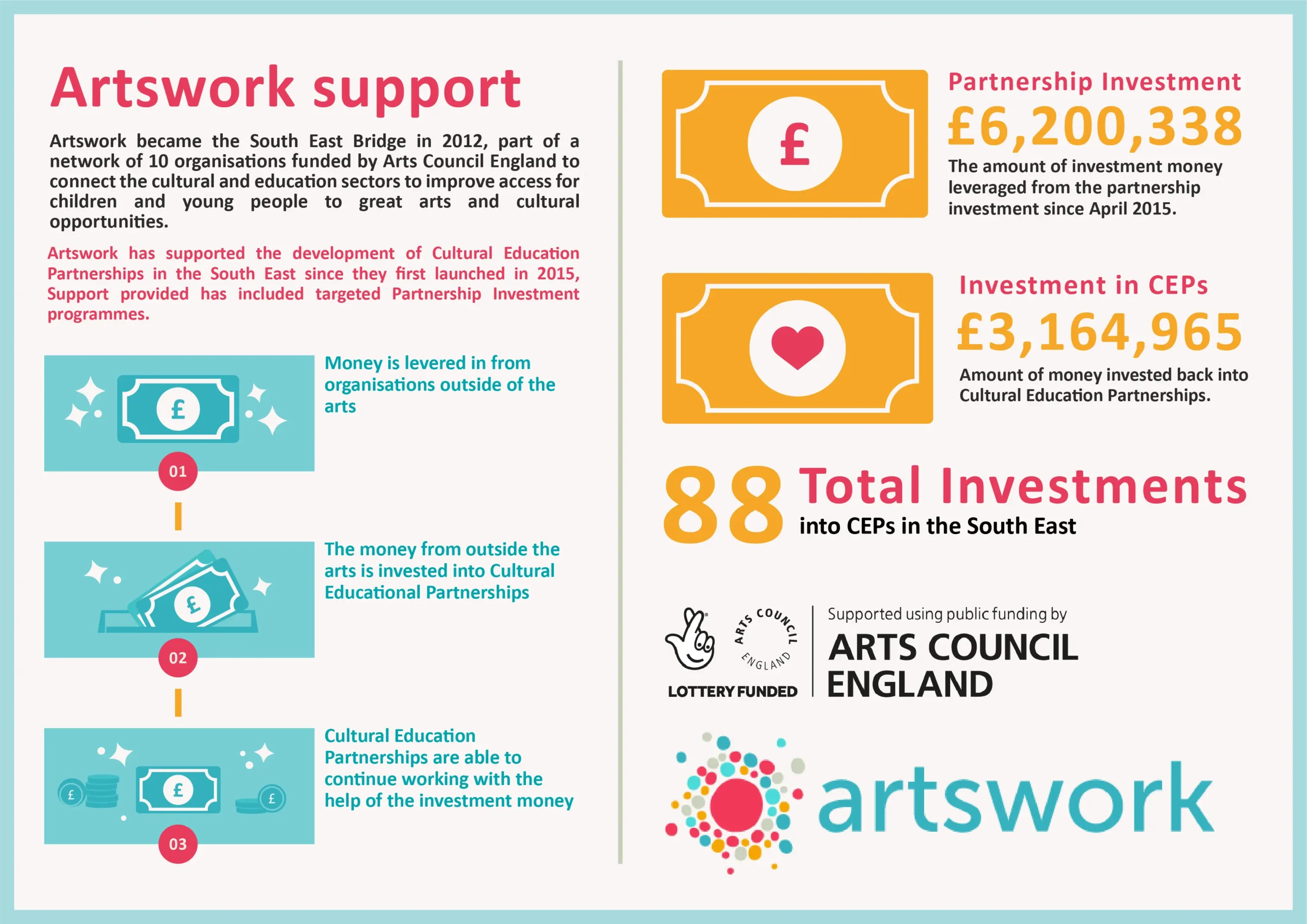
To get over this problem, Artswork asked us to help them create a series of infographics that would tell the real story of some of the data they have collected. In particular, this data related to Cultural Education Partnerships in the South East. The brief for these infographics was simple; convey the data provided to us in a way that was as creative as the work that they do.
Initial design concepts
What we did
The most important thing we had to do right at the start of the project was determine what the story was. There was a lot of information that we could work with, but anything we used had to feel right. It all had to connect together and give the audience a narrative that they couldn’t understand and relate to. The narrative that we settled on was actually a fairly simple one. It starts off with what Artswork did in relation to the Cultural Education Partnerships, before moving on to the people this impacted and finishing up on what this impact looked like in real terms. It felt like a logical way to piece the information together. At the same time though it meant finishing on an emotional high by talking about the very real ways in which young people have been positively impacted by the work.
Once the narrative was mapped out the next stage was working out how all of this would look. Artswork were very clear with us that the visuals of the infographics had to be prioritised as well as the story. That goes without saying, but we really did want to take the time to make sure that we were getting the visuals for the project right. We ran through some ideas and settled on a style that consisted of illustrated assets, photographic assets and text. This seemed like a style that would balance conveying important information and keeping the audience engaged.
The rough style was defined, but there was still plenty of work to be done on what the infographics would actually look like. We set about creating draft layouts and the pieces started to fit together. Once these were signed off we fleshed them out, creating the final assets, adding final photographic assets and updating any text for the final facts and figures.

The technical
Concept development
Schedules and timelines
Style development
Draft layouts
Asset creation
The result
The wider story behind the data.
The goal for this project was always to tell a story with what we created. Yes, this was about hard data, but that didn’t mean that it couldn’t be conveyed in a creative way. This was both from a storytelling perspective and a visual one. The outcome was a series of infographics that Artswork could use to communicate the impact of Cultural Education Partnerships. The infographics can now be used to engage with people that can help young people to access arts, culture and creativity.
